%20(1).png)
Elevating the Stage: Inspiring Event Presentation Design Examples for 2026

Updated: Sep 2
In 2026, a static slide deck isn't just a bit dull; it's a missed opportunity that can actively devalue your brand in front of a live audience. We've all felt the collective sigh in a room when "death by PowerPoint" takes over, or seen the visual disconnect when event presentation design fails to scale correctly on a massive LED wall. It's a common frustration for organisers who want to inspire their attendees but find themselves fighting technical glitches or washed-out colours instead. You deserve a stage presence that works with you, not against you.
The good news is that you can transform these technical hurdles into a powerful competitive advantage. This article will show you how to turn simple slides into immersive visual experiences that define your brand and captivate Australian audiences. We'll explore the latest trends in anamorphic LED content and the technical precision required for seamless execution across all digital touchpoints. By the end of this guide, you'll have a clear roadmap to achieve that elusive "wow" factor while ensuring your brand remains perfectly aligned from the first slide to the final curtain call.
Table of Contents
Defining Modern Event Presentation Design: More Than Just Slides
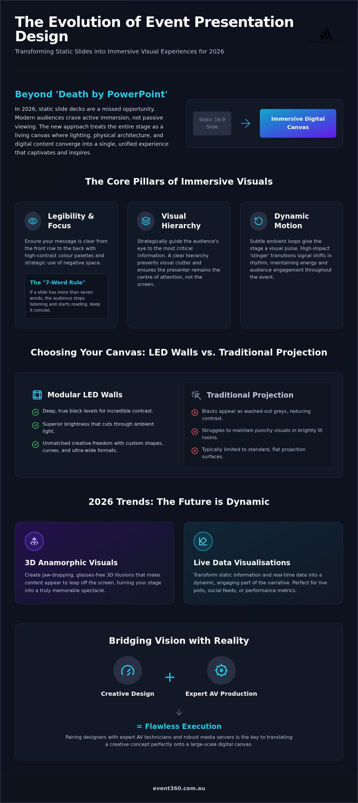
Event presentation design has undergone a radical transformation. It's no longer a task of simply populating a 16:9 slide deck with bullet points and stock imagery. In 2026, design is an environmental discipline. We view the entire stage as a living canvas where lighting, physical architecture, and digital content converge to create a single, unified experience. This holistic approach ensures your message isn't just heard; it's felt by every person in the room.
At its heart, this evolution is driven by the need for a cohesive visual narrative. This narrative acts as the connective tissue between your brand's values and the audience's emotional response. By mastering the core elements of a presentation, you move beyond mere information delivery. You're creating a journey. Every colour choice and motion graphic should serve this story. In large-scale venue settings, colour theory becomes even more critical. You must account for how high-intensity LED light interacts with ambient room lighting to maintain brand integrity and visual punch.
The Shift from Passive Viewing to Active Immersion
Audience expectations have shifted dramatically in the 2026 event landscape. Attendees are no longer content to sit and watch a speaker from a distance. They crave immersion. Static content often fails in this multi-screen world because it lacks the energy to compete with the distractions in our pockets. High-definition, large-scale visuals have a measurable psychological impact. They command the room and create a sense of scale that makes your brand feel authoritative and visionary. When you design for immersion, you turn a passive crowd into an engaged community.
The Technical Canvas: Aspect Ratios and Resolutions
Standard aspect ratios are a thing of the past for high-end productions. We're now designing for ultra-wide LED canvases that might span thirty metres or curve around the stage. This requires a deep understanding of pixel pitch and resolution. If your design doesn't account for the physical density of the LEDs, your graphics will look soft or pixelated to those in the front row. Executing these complex layouts requires professional audio visual production to map the content correctly. It's where the "can-do" attitude of creative design meets the grounded reality of technical expertise. Precision in the rig is the only way to ensure your vision translates perfectly to the big screen.
The Core Pillars of Immersive Visual Storytelling
Great event presentation design isn't just about making things look pretty. It's about engineering a visual environment that supports your speaker and drives home your message. To achieve this, we focus on three non-negotiable pillars: motion, hierarchy, and legibility. Without these, even the most expensive screen becomes a distraction. Hierarchy allows us to direct the audience's eye exactly where it needs to be, while legibility ensures that the person in the very back row of a massive auditorium doesn't miss a single detail.
One of the most effective tools for maintaining focus is the "7-word rule". If a slide has more than seven words, your audience will stop listening to the speaker and start reading the screen. We use negative space strategically to solve this. By leaving breathing room around key elements, we allow the presenter to "pop" against the digital backdrop. In bright Australian venue environments, we always opt for high-contrast palettes. Deep blacks and vibrant highlights ensure your content remains crisp and punchy, even when the house lights are up for networking sessions.
Motion Graphics and Dynamic Backgrounds
Static screens can feel dead. To keep the energy high, we use subtle ambient loops that give the stage a visual pulse without pulling focus from the presenter. These dynamic backgrounds serve a subconscious purpose; they reinforce brand themes through texture and movement. We also utilise "stingers", which are short, high-impact motion transitions, to signal a shift in the event's rhythm. Whether it's moving from a keynote to a panel discussion, these transitions maintain the momentum and keep the audience's attention locked on the stage.
Cohesive Branding Across Every Pixel
Your stage is the ultimate expression of your brand. It's vital that your led wall hire choice aligns perfectly with your digital brand guidelines. We ensure that the colour calibration on the day matches your corporate identity with absolute precision. This cohesion extends to hybrid elements as well. We integrate live-stream overlays with on-site visuals so the experience is identical for both physical and remote attendees. Typography is another critical factor. We select and test custom fonts specifically for their readability at a distance of 50 metres or more. If you're ready to see how these pillars can transform your next show, it's worth exploring our creative production solutions to see what's possible when technology and design align.
Choosing Your Canvas: LED Walls vs. Traditional Projection
Selecting the right hardware is the first creative decision in any event presentation design. While projectors served us well for decades, the 2026 standard for high-end corporate events has shifted decisively toward LED walls. The primary reason is design freedom. Projectors are often limited by throw distances and fixed aspect ratios, whereas LED panels allow us to build a digital canvas that fits the room perfectly. This shift ensures your visuals remain the focal point, regardless of the venue's architectural quirks. To see how these high-end digital displays are integrated into premium brand environments internationally, check out A Plus Advertising LLC.
One technical nuance that separates a professional show from an amateur one is "black levels". Projectors work by throwing light onto a surface; they cannot project the colour black. This means your darkest shadows are only as dark as the screen itself under the venue's ambient light. In contrast, LED panels are emissive. To show black, the pixel simply turns off. This creates a cinematic depth and vibrant contrast that makes your visuals pop, even in sun-drenched Australian convention centres where ambient light is often a challenge. LED technology punches through the glare to maintain your brand's true colours.
Modular LED panels allow us to break free from the traditional rectangular screen. We can design L-shaped wraps, digital pillars, or even ceiling-hung displays that surround the audience in a 360-degree environment. This flexibility also supports complex "picture-in-picture" feeds, where live camera shots of the speaker are integrated directly into the background graphics. When organising your av equipment hire, it's essential to include a design consultation. You need to know how your content will map across these custom shapes before the first panel is rigged to avoid awkward cropping or stretched logos.
Resolution Reality: Designing for 4K and Beyond
Designing for a 10-metre wide screen is a different beast compared to a standard laptop monitor. You can't just scale up a low-res JPEG and hope for the best. To avoid pixelation, we rely heavily on vector assets and ultra-high-resolution photography. Every pixel counts when your audience is sitting just a few metres away from the stage. Smooth playback is equally important. High-bitrate 4K video files require powerful media servers to ensure there's no stuttering or lag. It's about technical precision meeting creative ambition to deliver a flawless visual experience that feels both massive and intimate.
5 Game-Changing Examples of Event Presentation Design in Action
Seeing event presentation design in practice is the best way to understand how these technologies work together to elevate a brand. By 2026, the most successful events have moved beyond simple slide-sharing to create environments that react to the speaker and the audience in real-time. These examples represent the cutting edge of what's possible when you combine creative content with technical mastery.
The 3D Anamorphic Keynote
Anamorphic design is a tool for forced perspective. It allows us to create the illusion of three-dimensional depth on a completely flat LED surface. By calculating the exact viewing angle of the audience, we can make products appear to float in mid-air or burst out from the screen toward the front row. This technique is particularly effective for high-stakes product launches and "future-facing" brand reveals where you want to leave a lasting impression. It turns a standard keynote into a cinematic event that attendees will be compelled to film and share on social media.
Another powerful application is the data-driven live visualisation. Instead of showing a static bar chart of audience poll results, we transform that data into generative art. As the audience votes via their mobile devices, the background of the stage shifts in colour and complexity, creating a visual representation of the room's collective sentiment. Similarly, a synchronised multi-screen journey allows content to flow seamlessly across separate LED pillars and ceiling hangs, drawing the eye around the entire room and maintaining a high level of sensory engagement.
The Hybrid-First Virtual Stage
Designing for a hybrid audience requires a dual-focus strategy. You aren't just designing for the people in the room; you're designing for the camera lens. This means creating a cohesive on-stage visual environment where remote speakers appear as if they're standing right next to the physical presenter. We use digital "set pieces" to bridge this gap, ensuring that brand elements remain consistent for both mobile viewers and front-row attendees. This level of audio visual australia expertise is essential for maintaining professional standards across every digital touchpoint.
Finally, the minimalist high-contrast showcase proves that sometimes less is more. By using bold, custom typography and massive amounts of negative space, we create a look that is both modern and authoritative. This style relies on the superior black levels of LED walls mentioned earlier to make the text feel like it's etched into the atmosphere. If you're ready to bring one of these visions to life, it's time to partner with our creative content team to start building your 2026 stage experience.
Executing the Vision: Technical Production Meets Creative Design
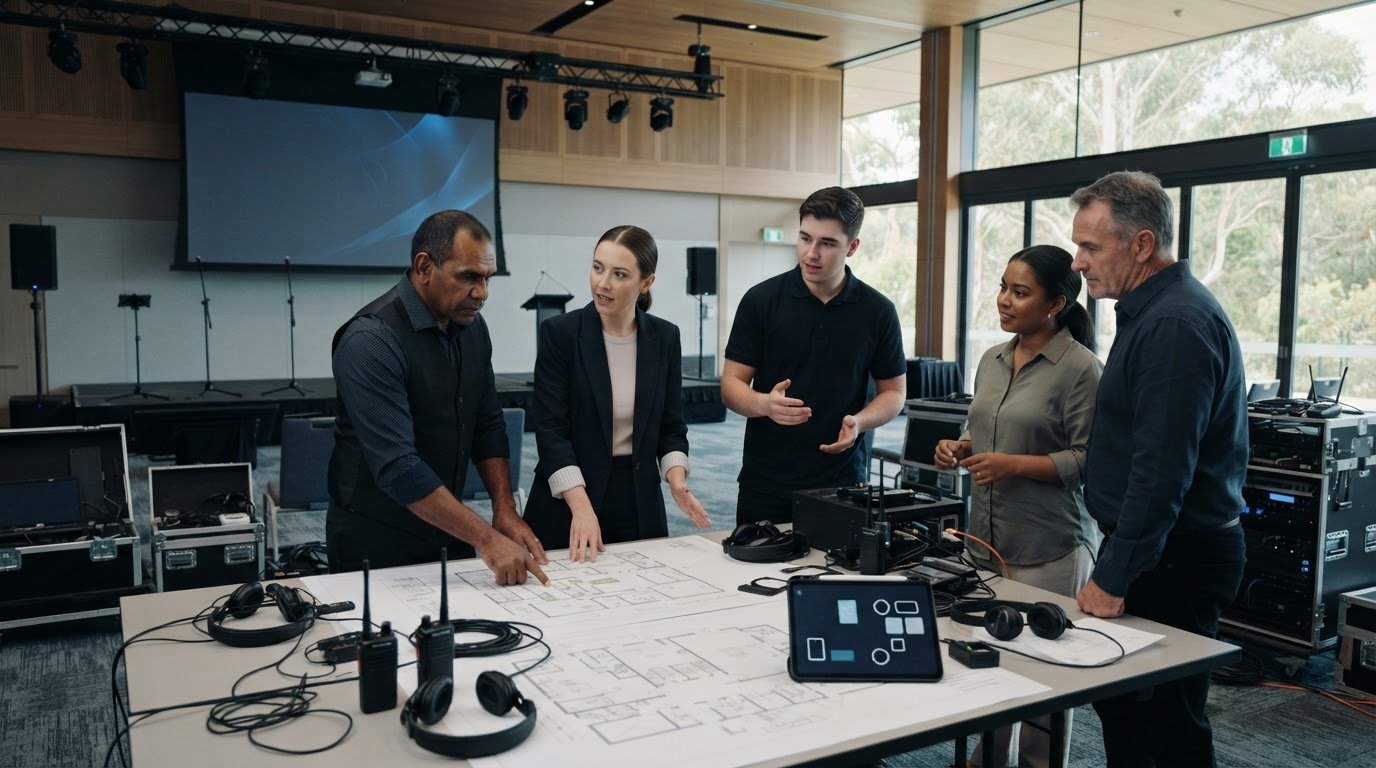
The most ambitious event presentation design remains a digital file until a skilled technician brings it to life on stage. This transition is where the real magic happens. A designer must work hand-in-hand with the AV technician from the earliest stages of a project. They aren't separate departments; they are two sides of the same coin. The technician understands the physical limits of the hardware, while the designer pushes the boundaries of what the audience perceives. This partnership ensures that the creative vision is never compromised by technical constraints.
Media servers like Disguise or Watchout serve as the brains of these complex shows. They don't just play video files; they manage the entire visual environment by mapping content across irregular surfaces and synchronising it with the wider lighting rig. This technical labor is the invisible hero of every successful production. Precision in the AV rig is the backbone of great design. To provide peace of mind, we always build redundancy into our systems. Whether it is a secondary backup server or "safe" slides ready for immediate trigger, we ensure the audience never sees a glitch or a technical hiccup.
The Rehearsal: Where Design Meets Reality
Testing is a non-negotiable phase of our process. We perform deep colour calibration on the actual LED wall to ensure your brand's palette looks perfect under the specific stage lights of the venue. We also verify legibility by checking font sizes from the furthest seat in the house. A full technical run-through is essential for timed motion graphics, ensuring every transition feels snappy and purposeful. It's about refining the rhythm of the show until it feels like a well-rehearsed professional presentation.
Partnering with a Full-Service Production House
Choosing a partner like Event 360 means you get a single point of contact for both creative content and world-class AV hardware. We remove the friction between the initial concept and the final execution by managing every intricate detail on your behalf. This integrated approach allows for a seamless flow of information, ensuring that the people building the screens are the same ones designing the content that goes on them. Moving from a Pinterest board to a live production requires a partner who is comfortable with complexity and driven by the final outcome. We're ready to transform your initial ideas into an immersive experience that leaves your Australian audience inspired and well-informed.
Master the Future of Live Visuals
Transforming your stage from a simple platform into an immersive digital environment is the hallmark of successful 2026 events. We've explored how moving beyond the 16:9 frame and embracing advanced event presentation design can redefine your brand's presence. By prioritising high-contrast LED wall solutions and synchronising your creative narrative with technical precision, you ensure your message resonates long after the house lights come up. The synergy between bold creative content and expert technical labor isn't just a luxury; it's the foundation of a frictionless production.
Ready to move from a static concept to a high-impact reality? With our MICE event specialisation, state-of-the-art LED wall solutions, and nationwide technical support, we're here to manage every intricate detail. Enquire about bespoke event presentation design and AV solutions to start building your next visual journey. Your audience is waiting for a show that truly captivates, and we have the "can-do" attitude and technical mastery to deliver it. Let's create something extraordinary together.
Frequently Asked Questions
What is the best software for event presentation design?
While PowerPoint and Google Slides remain staples, 2026 sees a rise in AI-driven tools like Beautiful.ai for rapid layout. However, for professional event presentation design, we typically use the Adobe Creative Suite to craft bespoke, high-resolution assets. These designs are then integrated into professional playback systems. This process ensures your visuals scale perfectly across large-format displays without any loss of quality, providing a polished and authoritative brand presence.
How do I design for a massive LED wall without the image looking blurry?
To keep visuals sharp, you must design for the screen's specific pixel pitch and native resolution. Use vector graphics where possible, as these scale infinitely without any loss of detail. If you are using photography, ensure it is high-resolution and hasn't been heavily compressed. Designing at a 1:1 pixel ratio is the most reliable way to guarantee that your graphics remain crisp and clear on a massive LED wall.
What is the difference between a slide deck and a media server show?
A standard slide deck is a simple, linear progression of images, while a media server show is a dynamic, multi-layered visual environment. Media servers allow us to map content across complex stage shapes and synchronise visuals with lighting and audio triggers. This approach moves your presentation from a passive viewing experience to an active, immersive digital set. It creates a seamless journey that reacts to the speaker and captivates the audience.
How much text should I include on an event presentation slide?
Minimal text is the secret to a high-impact presentation. We recommend sticking to the "7-word rule" per slide to ensure your audience stays focused on the speaker rather than reading the screen. Use high-contrast colours and bold weights to make key points legible from the back of a large auditorium. This strategy prevents information overload and ensures your core message is delivered with clarity and punch in any venue.
Can I use my standard brand fonts for a large-scale event?
You can use your brand fonts, but they must be tested for large-scale legibility. Some delicate serifs or thin weights can blur when displayed on high-intensity LED screens at a distance. We often suggest using bolder versions of your corporate typefaces and increasing the tracking to ensure every word is readable from 50 metres away. Testing these elements during the rehearsal phase is a critical step in our technical production process.
What are the top trends for event presentation design in 2026?
The leading trends for 2026 include 3D anamorphic content that creates a forced perspective and real-time data visualisations that turn live polling into generative art. There is also a major focus on digital accessibility and sensory-friendly design. Incorporating these elements ensures your event is inclusive for everyone, including those with neurodiverse needs. It is about using technology to create a more human, engaging, and accessible experience for every attendee.
How do I ensure my presentation looks good for both live and virtual audiences?
Successful hybrid events require a design that works for both the camera and the room. We use high-contrast palettes that look sharp on mobile devices while maintaining strategic negative space so the physical speaker remains the focal point on stage. By synchronising on-site visuals with live-stream overlays, we create a unified brand experience. This ensures your message is delivered with equal impact to both your physical and virtual Australian audiences.
Why should I hire a professional for my event presentation design?
Hiring a professional removes the technical friction that often plagues live productions. We manage the intricate details of pixel mapping, server redundancy, and colour calibration, providing you with total peace of mind. Our expertise in MICE events and nationwide technical support ensures your vision is executed with absolute precision. It allows you to focus on your delivery while we handle the complex logistics required to create a truly "wow" factor.
Comments